Clay
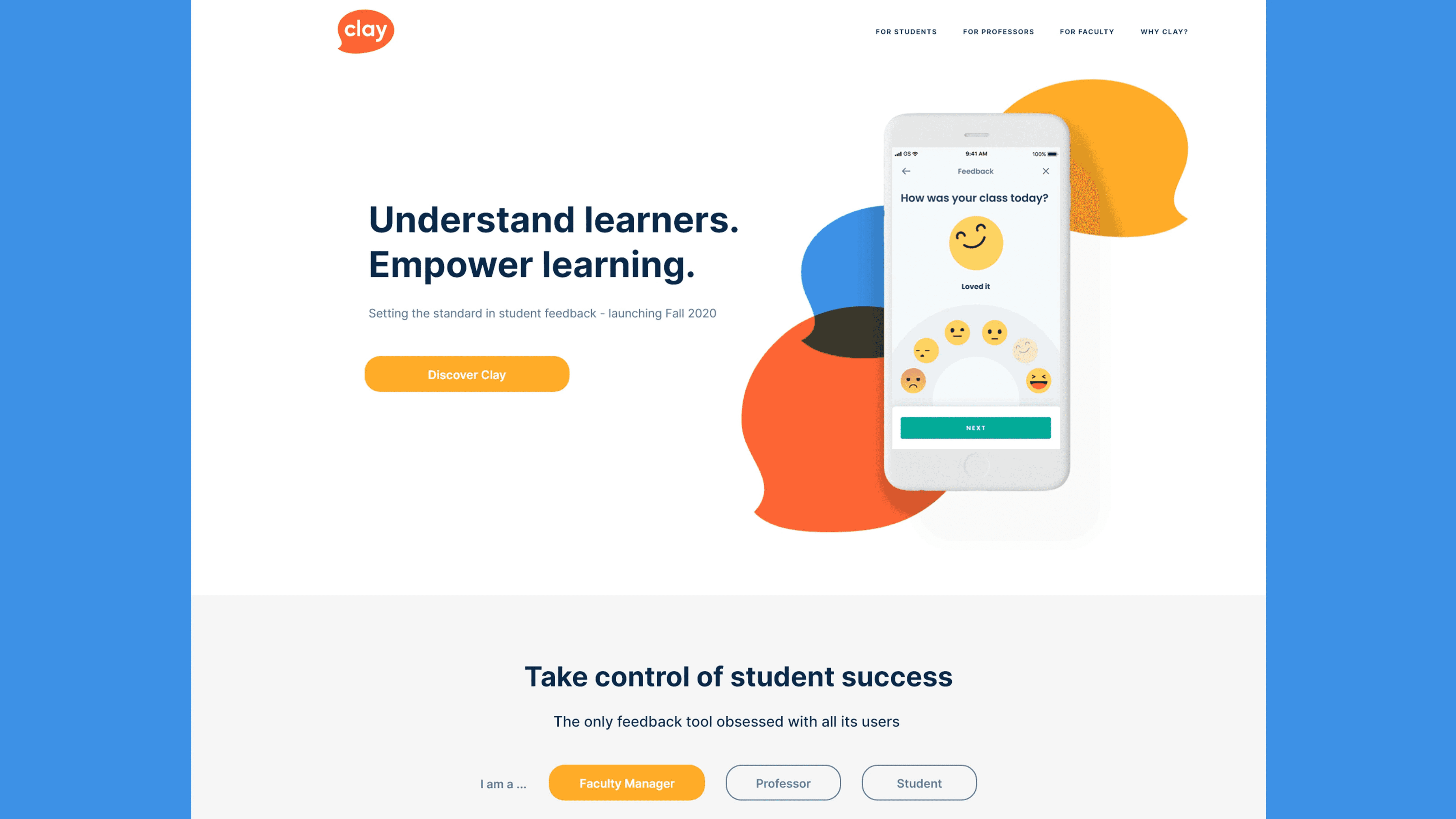
Clay is an app for gathering feedback of students’ experiences at universities and in higher education. For launch, the team needed a suitable microsite which would communicate the value of the app for sell-in to an academic audience. Working to a short timeframe, I designed and developed a microsite and brand identity for Clay.
Client
Clay
Services
Concept UI Design system
Media
Figma Illustrator

Provide a low maintenance brand style that can feasibly be created in-house Develop a cross-sectional style that clearly articulates the value for students, teaching staff and institutions alike Communicate brand values of transparency, trust and personalisation
Clay’s new brand language carried the same pliability and smooth lines of that material, including a versatile brand pattern of ‘blob’ forms. These shapes are all rounded off apart from one tip, to make them resemble speech bubbles (in reference to Clay’s function as a feedback app). The colour palette ranges through colour temperatures, from warm yellow and orange through to cool blues. This spectrum of temperatures is a reference to the feedback submitted through the app.

